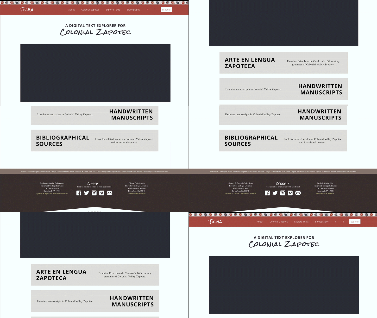
This website was redesigned for the Ticha project from the Digital Scholarship program at Haverford College.
The original website didn't have a style guide or standard content layout, so my task was to streamline the existing content and create a simple base layout that could be maintained by the team as they furthered their research.
There were a few design choices in the original design that didn't add much value to the website, such as textured buttons and badly aligned photos that weren't necessarily relevant to the content they appeared on the same page as. For the redesign, it was important to me to use every element intentionally.
I simplified the navigation to a single row and shifted the Zapotec pattern from the bottom border to the top border to make the navigation feel more integrated to the rest of the page. I styled the footer in a similar way to the new navigation, this time making the element more distinct from the rest of the page, but still cohesive overall. Because this research project has so much and such a variety of content, this base layout was effective for balance and featured the content at the forefront.
For the content itself, I standardised headings and better aligned images so that they wouldn't interrupt the flow of content.
This website redesign is launched, and new content continues to be updated by the Ticha team.
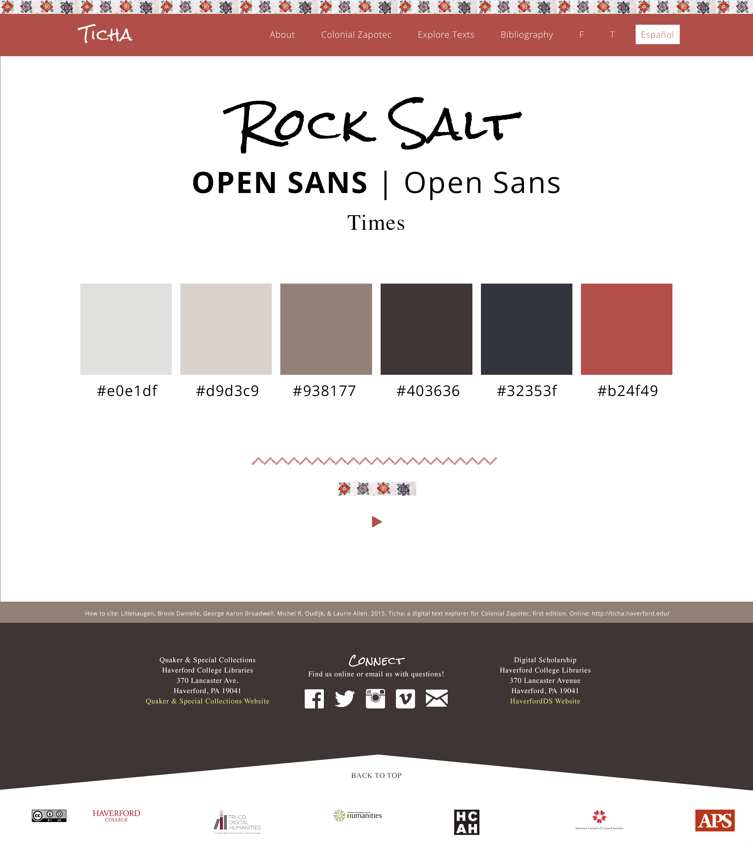
Style guide
